heatmap: Create a heatmap in matplotlib
Utility function for creating a heatmap via matplotlib
from mlxtend.plotting import heatmap
Overview
A simple function that creates nice-looking heatmaps from NumPy arrays using matplotlib and the Viridis color palette by default.
References
- -
Example 1 -- Simple heatmap
from mlxtend.plotting import heatmap
import matplotlib.pyplot as plt
import numpy as np
import pandas as pd
np.random.seed(123)
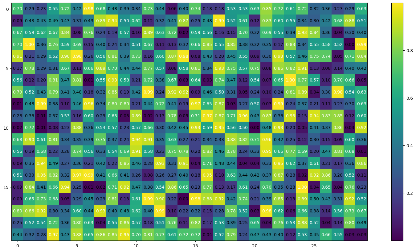
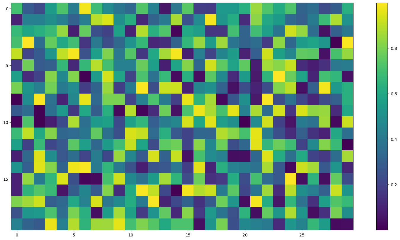
some_array = np.random.random((20, 30))
heatmap(some_array, figsize=(20, 10))
plt.show()
The cell values can be suppressed by setting cell_values=False:
heatmap(some_array, figsize=(20, 10), cell_values=False)
plt.show()
Example 2 -- Correlation matrix as heatmap
from mlxtend.plotting import heatmap
import matplotlib.pyplot as plt
import numpy as np
import pandas as pd

df = pd.read_csv('https://raw.githubusercontent.com/rasbt/'
                 'python-machine-learning-book-2nd-edition'
                 '/master/code/ch10/housing.data.txt',
                 header=None,
                 sep='\s+')

df.columns = ['CRIM', 'ZN', 'INDUS', 'CHAS',
              'NOX', 'RM', 'AGE', 'DIS', 'RAD',
              'TAX', 'PTRATIO', 'B', 'LSTAT', 'MEDV']
df.head()
| CRIM | ZN | INDUS | CHAS | NOX | RM | AGE | DIS | RAD | TAX | PTRATIO | B | LSTAT | MEDV | |
|---|---|---|---|---|---|---|---|---|---|---|---|---|---|---|
| 0 | 0.00632 | 18.0 | 2.31 | 0 | 0.538 | 6.575 | 65.2 | 4.0900 | 1 | 296.0 | 15.3 | 396.90 | 4.98 | 24.0 |
| 1 | 0.02731 | 0.0 | 7.07 | 0 | 0.469 | 6.421 | 78.9 | 4.9671 | 2 | 242.0 | 17.8 | 396.90 | 9.14 | 21.6 |
| 2 | 0.02729 | 0.0 | 7.07 | 0 | 0.469 | 7.185 | 61.1 | 4.9671 | 2 | 242.0 | 17.8 | 392.83 | 4.03 | 34.7 |
| 3 | 0.03237 | 0.0 | 2.18 | 0 | 0.458 | 6.998 | 45.8 | 6.0622 | 3 | 222.0 | 18.7 | 394.63 | 2.94 | 33.4 |
| 4 | 0.06905 | 0.0 | 2.18 | 0 | 0.458 | 7.147 | 54.2 | 6.0622 | 3 | 222.0 | 18.7 | 396.90 | 5.33 | 36.2 |
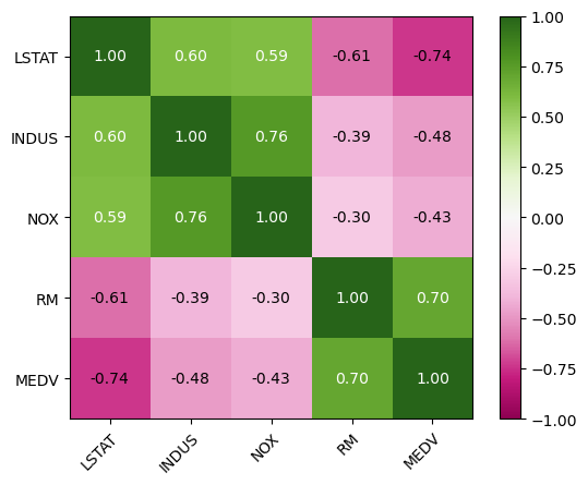
from matplotlib import cm

cols = ['LSTAT', 'INDUS', 'NOX', 'RM', 'MEDV']

corrmat = np.corrcoef(df[cols].values.T)
fig, ax = heatmap(corrmat, column_names=cols, row_names=cols, cmap=cm.PiYG)

# set colorbar cutoff at -1, 1
for im in ax.get_images():
    im.set_clim(-1, 1)

plt.show()
API
heatmap(matrix, hide_spines=False, hide_ticks=False, figsize=None, cmap=None, colorbar=True, row_names=None, column_names=None, column_name_rotation=45, cell_values=True, cell_fmt='.2f', cell_font_size=None, text_color_threshold=None)
Plot a heatmap via matplotlib.
Parameters
-
conf_mat: array-like, shape = [n_rows, n_columns]And arbitrary 2D array.
-
hide_spines: bool (default: False)Hides axis spines if True.
-
hide_ticks: bool (default: False)Hides axis ticks if True
-
figsize: tuple (default: (2.5, 2.5))Height and width of the figure
-
cmap: matplotlib colormap (default:None)Uses matplotlib.pyplot.cm.viridis if
None -
colorbar: bool (default: True)Shows a colorbar if True
-
row_names: array-like, shape = [n_rows] (default: None)List of row names to be used as y-axis tick labels.
-
column_names: array-like, shape = [n_columns] (default: None)List of column names to be used as x-axis tick labels.
-
column_name_rotation: int (default: 45)Number of degrees for rotating column x-tick labels.
-
cell_values: bool (default: True)Plots cell values if True.
-
cell_fmt: string (default: '.2f')Format specification for cell values (if
cell_values=True) -
cell_font_size: int (default: None)Font size for cell values (if
cell_values=True) -
text_color_threshold: float (default: None)Threshold for the black/white text threshold of the text annotation. Default (None) tried to infer a good threshold automatically using
np.max(normed_matrix) / 2.
Returns
-
fig, ax: matplotlib.pyplot subplot objectsFigure and axis elements of the subplot.
Examples
For usage examples, please see https://rasbt.github.io/mlxtend/user_guide/plotting/heatmap/