enrichment_plot: create an enrichment plot for cumulative counts
A function to plot step plots of cumulative counts.
from mlxtend.general import enrichment_plot
Overview
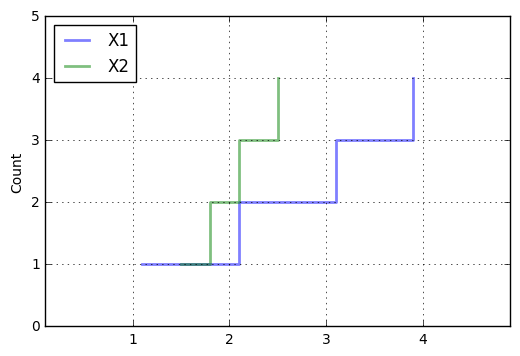
In enrichment plots, the y-axis can be interpreted as "how many samples are less or equal to the corresponding x-axis label."
References
- -
Example 1 - Enrichment Plots from Pandas DataFrames
import pandas as pd


s1 = [1.1, 1.5]
s2 = [2.1, 1.8]
s3 = [3.1, 2.1]
s4 = [3.9, 2.5]
data = [s1, s2, s3, s4]
df = pd.DataFrame(data, columns=['X1', 'X2'])
df
| X1 | X2 | |
|---|---|---|
| 0 | 1.1 | 1.5 |
| 1 | 2.1 | 1.8 |
| 2 | 3.1 | 2.1 |
| 3 | 3.9 | 2.5 |
Plotting the data where the categories are determined by the unique values in the label column label_col. The x and y values are simply the column names of the DataFrame that we want to plot.
import matplotlib.pyplot as plt
from mlxtend.plotting import enrichment_plot

ax = enrichment_plot(df, legend_loc='upper left')
API
enrichment_plot(df, colors='bgrkcy', markers=' ', linestyles='-', alpha=0.5, lw=2, where='post', grid=True, count_label='Count', xlim='auto', ylim='auto', invert_axes=False, legend_loc='best', ax=None)
Plot stacked barplots
Parameters
-
df: pandas.DataFrameA pandas DataFrame where columns represent the different categories. colors: str (default: 'bgrcky') The colors of the bars.
-
markers: str (default: ' ')Matplotlib markerstyles, e.g, 'sov' for square,circle, and triangle markers.
-
linestyles: str (default: '-')Matplotlib linestyles, e.g., '-,--' to cycle normal and dashed lines. Note that the different linestyles need to be separated by commas.
-
alpha: float (default: 0.5)Transparency level from 0.0 to 1.0.
-
lw: int or float (default: 2)Linewidth parameter.
-
where: {'post', 'pre', 'mid'} (default: 'post')Starting location of the steps.
-
grid: bool (default:True)Plots a grid if True.
-
count_label: str (default: 'Count')Label for the "Count"-axis.
-
xlim: 'auto' or array-like [min, max] (default: 'auto')Min and maximum position of the x-axis range.
-
ylim: 'auto' or array-like [min, max] (default: 'auto')Min and maximum position of the y-axis range.
-
invert_axes: bool (default: False)Plots count on the x-axis if True.
-
legend_loc: str (default: 'best')Location of the plot legend {best, upper left, upper right, lower left, lower right} No legend if legend_loc=False
-
ax: matplotlib axis, optional (default: None)Use this axis for plotting or make a new one otherwise
Returns
ax: matplotlib axis
Examples
For usage examples, please see https://rasbt.github.io/mlxtend/user_guide/plotting/enrichment_plot/