scatter_hist: create a scatter histogram plot
A function to quickly produce a scatter histogram plot.
from mlxtend.plotting import scatter_hist
Overview
References
- https://matplotlib.org/gallery/lines_bars_and_markers/scatter_hist.html
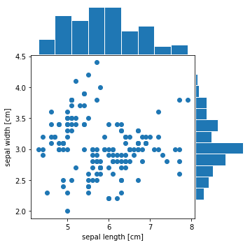
Example 1 - Scatter Plot and Histograms from Pandas DataFrames
from mlxtend.data import iris_data
from mlxtend.plotting import scatter_hist
import pandas as pd


X, y = iris_data()
df = pd.DataFrame(X)
df.columns = ['sepal length [cm]', 'sepal width [cm]', 'petal length [cm]', 'petal width [cm]']
df.head(5)
| sepal length [cm] | sepal width [cm] | petal length [cm] | petal width [cm] | |
|---|---|---|---|---|
| 0 | 5.1 | 3.5 | 1.4 | 0.2 |
| 1 | 4.9 | 3.0 | 1.4 | 0.2 |
| 2 | 4.7 | 3.2 | 1.3 | 0.2 |
| 3 | 4.6 | 3.1 | 1.5 | 0.2 |
| 4 | 5.0 | 3.6 | 1.4 | 0.2 |
import matplotlib.pyplot as plt
from mlxtend.plotting import scatter_hist


fig = scatter_hist(df["sepal length [cm]"], df["sepal width [cm]"])
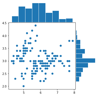
Example 2 - Category Scatter from NumPy Arrays
from mlxtend.data import iris_data
from mlxtend.plotting import scatter_hist
import pandas as pd


X, y = iris_data()
X[:5]
array([[5.1, 3.5, 1.4, 0.2],
       [4.9, 3. , 1.4, 0.2],
       [4.7, 3.2, 1.3, 0.2],
       [4.6, 3.1, 1.5, 0.2],
       [5. , 3.6, 1.4, 0.2]])
fig = scatter_hist(X[:, 0], X[:, 1])
API
scatter_hist(x, y, xlabel=None, ylabel=None, figsize=(5, 5))
Scatter plot and individual feature histograms along axes.
Parameters
-
x: 1D array-like or Pandas SeriesX-axis values.
-
y: 1D array-like or Pandas SeriesY-axis values.
-
xlabel: str (default:None)Label for the X-axis values. If
xis a pandas Series, andxlabelisNone, the label is inferred automatically. -
ylabel: str (default:None)Label for the X-axis values. If
yis a pandas Series, andylabelisNone, the label is inferred automatically. -
figsize: tuple (default:(5, 5))Matplotlib figure size.
Returns
plot: Matplotlib Figure object