plot_pca_correlation_graph: plot correlations between original features and principal components
A function to provide a correlation circle for PCA.

> from mlxtend.plotting import plot_pca_correlation_graph
In a so called correlation circle, the correlations between the original dataset features and the principal component(s) are shown via coordinates.
Example
The following correlation circle examples visualizes the correlation between the first two principal components and the 4 original iris dataset features.
- Features with a positive correlation will be grouped together.
- Totally uncorrelated features are orthogonal to each other.
- Features with a negative correlation will be plotted on the opposing quadrants of this plot.
from mlxtend.data import iris_data
from mlxtend.plotting import plot_pca_correlation_graph
import numpy as np
X, y = iris_data()

X_norm = X / X.std(axis=0) # Normalizing the feature columns is recommended

feature_names = [
  'sepal length',
  'sepal width',
  'petal length',
  'petal width']

figure, correlation_matrix = plot_pca_correlation_graph(X_norm,
                                                        feature_names,
                                                        dimensions=(1, 2),
                                                        figure_axis_size=10)
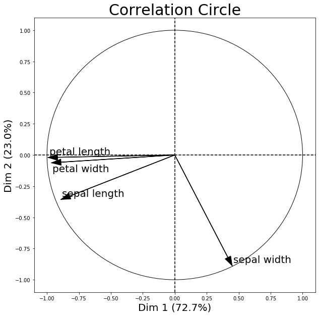
correlation_matrix
| Dim 1 | Dim 2 | |
|---|---|---|
| sepal length | -0.891224 | -0.357352 |
| sepal width | 0.449313 | -0.888351 |
| petal length | -0.991684 | -0.020247 |
| petal width | -0.964996 | -0.062786 |
Further, note that the percentage values shown on the x and y axis denote how much of the variance in the original dataset is explained by each principal component axis. I.e.., if PC1 lists 72.7% and PC2 lists 23.0% as shown above, then combined, the 2 principal components explain 95.7% of the total variance.
API
plot_pca_correlation_graph(X, variables_names, dimensions=(1, 2), figure_axis_size=6, X_pca=None, explained_variance=None)
Compute the PCA for X and plots the Correlation graph
Parameters
-
X: 2d array like.The columns represent the different variables and the rows are the samples of thos variables
-
variables_names: array likeName of the columns (the variables) of X
dimensions: tuple with two elements. dimensions to be plotted (x,y)
figure_axis_size : size of the final frame. The figure created is a square with length and width equal to figure_axis_size.
-
X_pca: np.ndarray, shape = [n_samples, n_components].Optional.
X_pcais the matrix of the transformed components from X. If not provided, the function computes PCA automatically using mlxtend.feature_extraction.PrincipalComponentAnalysis Expectedn_componentes >= max(dimensions) -
explained_variance: 1 dimension np.ndarray, length = n_componentsOptional.
explained_varianceare the eigenvalues from the diagonalized covariance matrix on the PCA transformatiopn. If not provided, the function computes PCA independently Expectedn_componentes == X.shape[1]
Returns
matplotlib_figure, correlation_matrix
Examples
For usage examples, please see https://rasbt.github.io/mlxtend/user_guide/plotting/plot_pca_correlation_graph/