Scategory_scatter: Create a scatterplot with categories in different colors
A function to quickly produce a scatter plot colored by categories from a pandas DataFrame or NumPy ndarray object.
from mlxtend.general import category_scatter
Overview
References
- -
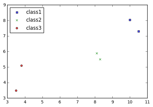
Example 1 - Category Scatter from Pandas DataFrames
import pandas as pd
from io import StringIO

csvfile = """label,x,y
class1,10.0,8.04
class1,10.5,7.30
class2,8.3,5.5
class2,8.1,5.9
class3,3.5,3.5
class3,3.8,5.1"""

df = pd.read_csv(StringIO(csvfile))
df
| label | x | y | |
|---|---|---|---|
| 0 | class1 | 10.0 | 8.04 |
| 1 | class1 | 10.5 | 7.30 |
| 2 | class2 | 8.3 | 5.50 |
| 3 | class2 | 8.1 | 5.90 |
| 4 | class3 | 3.5 | 3.50 |
| 5 | class3 | 3.8 | 5.10 |
Plotting the data where the categories are determined by the unique values in the label column label_col. The x and y values are simply the column names of the DataFrame that we want to plot.
import matplotlib.pyplot as plt
from mlxtend.plotting import category_scatter

fig = category_scatter(x='x', y='y', label_col='label',
                       data=df, legend_loc='upper left')
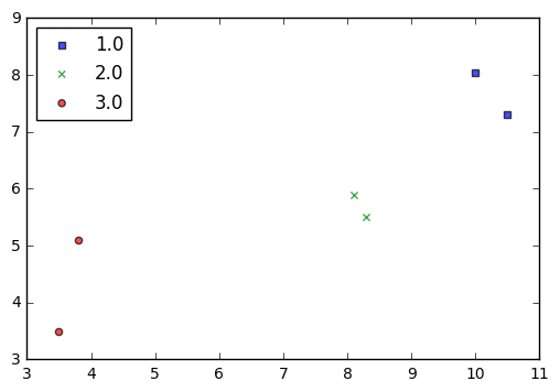
Example 2 - Category Scatter from NumPy Arrays
import numpy as np
from io import BytesIO

csvfile = """1,10.0,8.04
1,10.5,7.30
2,8.3,5.5
2,8.1,5.9
3,3.5,3.5
3,3.8,5.1"""

ary = np.genfromtxt(BytesIO(csvfile.encode()), delimiter=',')
ary
array([[  1.  ,  10.  ,   8.04],
       [  1.  ,  10.5 ,   7.3 ],
       [  2.  ,   8.3 ,   5.5 ],
       [  2.  ,   8.1 ,   5.9 ],
       [  3.  ,   3.5 ,   3.5 ],
       [  3.  ,   3.8 ,   5.1 ]])
Now, pretending that the first column represents the labels, and the second and third column represent the x and y values, respectively.
import matplotlib.pyplot as plt
from mlxtend.plotting import category_scatter

fix = category_scatter(x=1, y=2, label_col=0,
                       data=ary, legend_loc='upper left')
API
category_scatter(x, y, label_col, data, markers='sxo^v', colors=('blue', 'green', 'red', 'purple', 'gray', 'cyan'), alpha=0.7, markersize=20.0, legend_loc='best')
Scatter plot to plot categories in different colors/markerstyles.
Parameters
-
x: str or intDataFrame column name of the x-axis values or integer for the numpy ndarray column index.
-
y: strDataFrame column name of the y-axis values or integer for the numpy ndarray column index
-
data: Pandas DataFrame object or NumPy ndarray. -
markers: strMarkers that are cycled through the label category.
-
colors: tupleColors that are cycled through the label category.
-
alpha: float (default: 0.7)Parameter to control the transparency.
-
markersize: float (default` : 20.0)Parameter to control the marker size.
-
legend_loc: str (default: 'best')Location of the plot legend {best, upper left, upper right, lower left, lower right} No legend if legend_loc=False
Returns
fig: matplotlig.pyplot figure object
Examples
For usage examples, please see https://rasbt.github.io/mlxtend/user_guide/plotting/category_scatter/